Beauty is in the eye of the beholder
and you are the Beholder but in saying that, the image background can really make or break a great photo. The point of the image is to tell a story or to communicate a linear narrative. The context can in fact determine the story.
There is no single solution or set of rules to cover every situation. Note that composition also plays a huge roll.
Firstly it is paramount to consider the lighting on both your subject and the background. After all, photos are just a recording of light.
At least with digital, you can experiment with different setups and see the results instantly. The addition of camera mounted flash will highlight a face even with a bright light source in the background. A bright background (blurred) works well with outdoor shots .
Be sure to avoid dappled light on a subjects face. It is very difficult to fix in post-processing.
Image Background – Indoor Portraits
Professional backdrops are not paramount for indoor portraits to create a good background. You can simply use a bed sheet, a lace curtain or a wall. Reducing the depth of field can blur unwanted detail in the background. You can pull off a great result with a little imagination and experimentation with lighting.
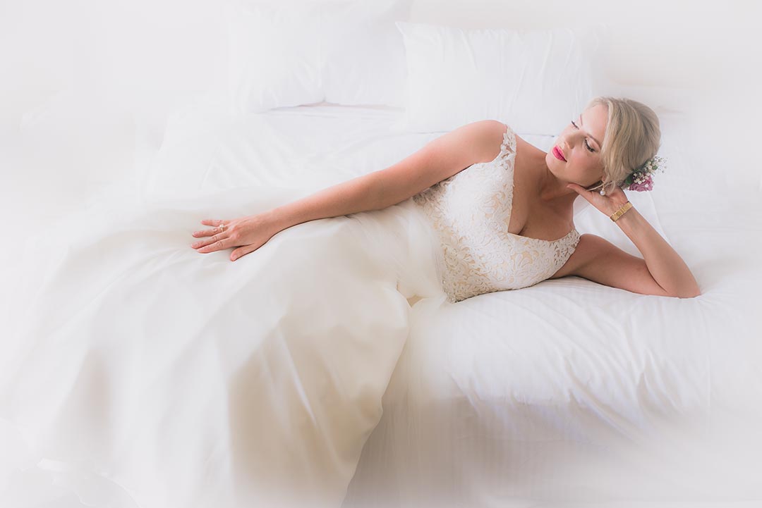
Image Background – Plain Background
A plain background (whether it is dark, light or mid range) provides total prominence to the subject/s being photographed. There are other advantages, such as reduced concern for the depth of field. Depth of field is difficult to control in the case of a mobile phones or basic click and shoot cameras. Take the example of the shot above. There is little else in the image to distract from the ‘JUST MARRIED’ sign.
The Alternatives
On the other hand, an interesting Image Background (whether it is scenery, a sunset, soft or blurry) adds interest to what may otherwise be a fairly ordinary shot. It needs to be said that when incorporating a background, consideration should be given to the brightness, hues and whether the colours are going to compliment or become an irritation.
Ask yourself, does the background support the story or just take over?
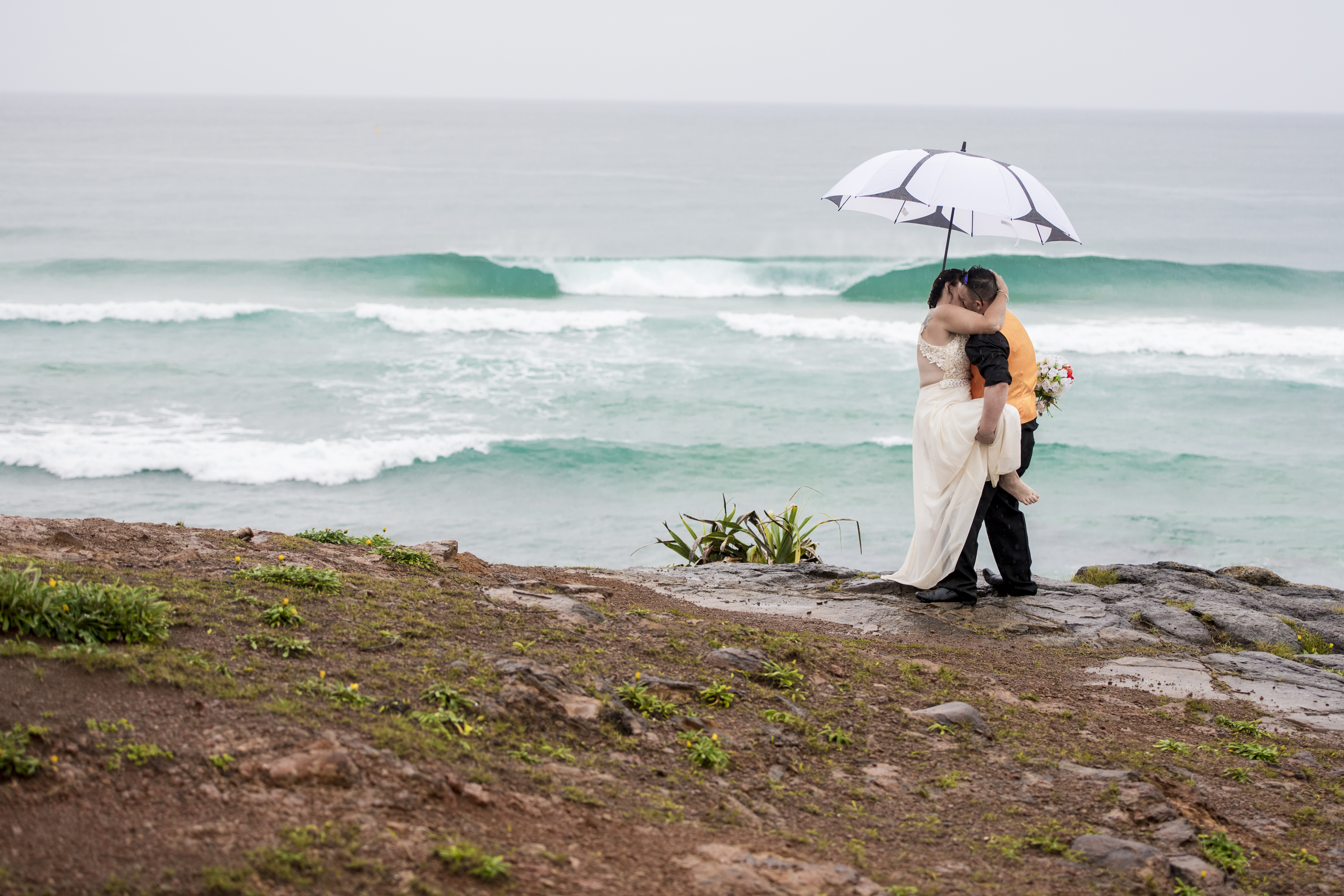
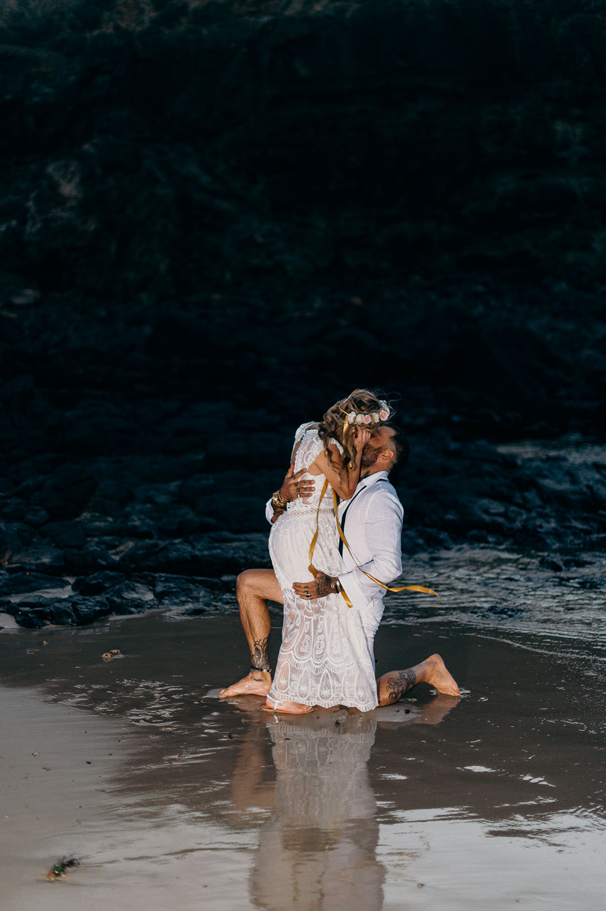
Artistic or Lost in Space

An image that makes the eye wander, is more attention-grabbing. Conversely, it can also be said that the wandering eye is too distracting from the subject/s.
Dark, bright or high contrast near the edges of an image distract from the subject. This is where visual weight is highest. The same goes for horizontal or vertical lines near the horizontal or vertical edges distracts from the subject. Try to avoid ending up with any distracting object in the corners.
My preference is for the image up above with the waves in the background. This is because though the background contrasts, it is not sufficient to stop my eye back moving back to the subjects. Also I think the third image is so busy, that the subjects are lost.
I am always interested to find out what you think?